Key ingredients for a fundraising-focused page
On any given weekend, you can find me in my kitchen trying a new recipe. Whether it’s one of the New York Times’ many soup or stew recipes, or something from kitchen maven extraordinaire Ina Garten, I’ve noticed there are some key similarities all good recipes have.
Always one for finding metaphorical connections between my work life and personal passions, I recently realized there’s a similar process between finding and whipping up a good recipe and creating a nonprofit website.
In both instances, there are some important ingredients you’ll want to include to whet the appetite and satisfy your visitors. And in nonprofit websites, you’ll want to consider a dual audience – both donors who want to support your work and individuals looking for help through the services you provide.
Stomach growling yet? Let’s get cooking!
First “Byte”: Homepage imagery
We’ve all heard the warning, “Don’t judge a book by its cover.” As much as I wish we’d all follow that advice, the truth is that visuals draw our attention and they stick with us. It’s estimated that humans only remember 20% of what we read, compared to 80% of what we see.
When looking for a new recipe to make, I’m more likely to move on to something else if there is no photo of the final dish. Similarly, a website with photos that take forever to load or dated graphics and images will be off-putting to your visitors and may even increase your bounce rate as they click away.
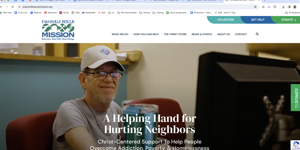
At BDI, we believe powerful photography and storytelling are a cornerstone of strong fundraising. The sites we create for our nonprofit client partners often feature a homepage takeover video that spans the width of the page, creating an immersive experience when visitors land on your site.
Click to watch this homepage video from BDI partner, Evansville Rescue Mission!>>
Plating: Clear layout & mobile-responsive design
In addition to captivating imagery, once your visitor has landed, you’ll want to give them a cohesive and intuitive path to follow to explore other areas of your site.
And with increasingly more people browsing the web and making donations via their smartphones, you should make sure that your design is mobile-responsive. This means that images, headlines and copy will automatically reflow to fit the user’s view – whether they’re visiting from a smartphone, tablet or desktop.
My husband often teases me for eating meals off my favorite plate or ice cream with my favorite “little” spoon, but trust me, sometimes the presentation really does enhance the entire experience!
Flavor: Consistent, integrated branding
I remember my favorite recipes by one unforgettable flavor. In a nonprofit website, I consider that most important flavor to be branding.
Branding is more than just your logo and color palette carried throughout the site. It extends to the way you talk about your programs, the way you infuse your mission and core beliefs throughout your site. If you’re not sure what characterizes your unique brand flavor, taking time to reflect on your current site and dream about your ideal site can help. Here are 10 questions you can ask when considering a nonprofit website rebuild.
When BDI redesigns or creates a new website, we ask our nonprofit partners to answer a simple but important questionnaire to evaluate what’s working for them currently and areas for improvement on their site (those missing spices!) in terms of branding. Some of these questions include:
- What do you love about your current site?
- What do you wish were different?
- What are some other organizations’ websites that you like? What elements stand out to you about them?
Flavor – or branding – is a powerful element on your site because it can stick with your visitors long after they click away. By evoking positive memories when seen elsewhere, your branding can draw them back to your website later, either to learn more or make a gift.
We’ve known about this powerful connection between flavors (or taste) and memory long before websites even existed… just ask my favorite French author, Marcel Proust, about his famous madeleines!
Spice: Building your brand with cohesive messaging
Making up the flavor of your branding is one important spice: your messaging. But you don’t want that spice to be “one note” (as my TV-watching guilty pleasure, celebrity chef Gordon Ramsay says).
Recently, when launching the writing stage of one of our client partners’ websites, BDI’s writing team gathered together for a rapid-fire brainstorming session. I love this opportunity to get all our “cooks into the kitchen” to collaborate on a winning recipe and “flavor profile” we’ll carry throughout a new or redesigned site.
The goal of our brainstorm was to settle on some key messaging points – along with SEO keyphrases – we could incorporate across all pages of the website. Not only does this strategy strengthen a nonprofit website’s ranking on search engines like Google through our keyword research, but it also gives a cohesive, integrated feel to the overall site.
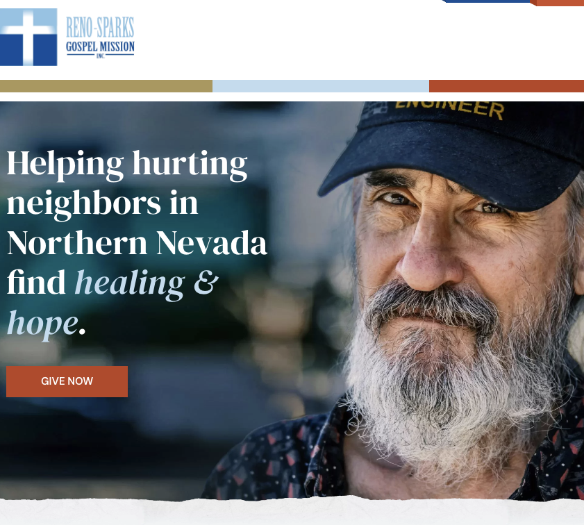
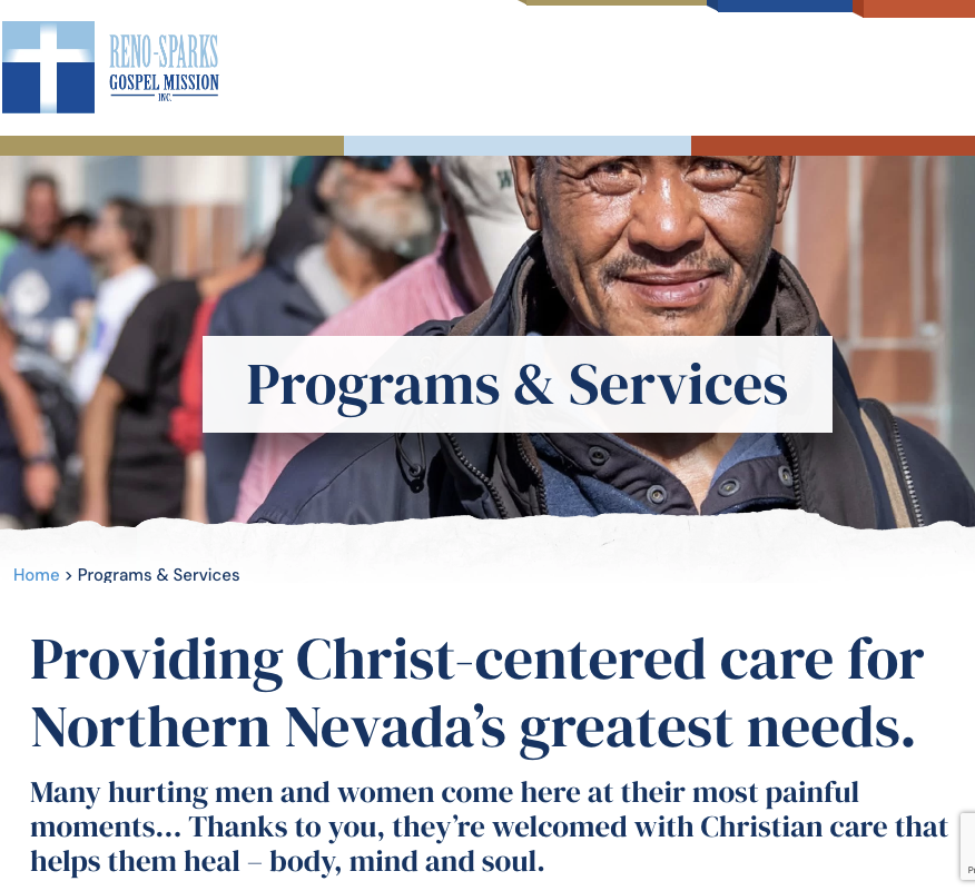
For example, in working with the Reno-Sparks Gospel Mission on a website redesign, we identified these messaging points that would be important to carry throughout the site:
- “Providing healing & hope”
- “Christ-centered or faith-based focus”
- “Help for people struggling with homelessness, hunger and addiction”
As you can see in the examples that follow, these were points we weaved into headlines and copy across their website to support their brand and give their organization a unique and welcoming voice – both to donors and also to individuals who may visit their site looking for help.
Click here to explore more of the integrated messaging on the Reno-Sparks Gospel Mission website!>>
In the words of Julia Child, “Bon Appetit!”
While there may be no perfect recipe – I believe there is a perfect recipe for you. I hope these tips will help streamline the process of creating a fundraising-focused website that feels true to who your organization is… and that at the end, you’ll say, *Chef’s Kiss* 👩🍳💋
Taking the time to gather your key ingredients, taste as you go and tweak as needed will result in an authentic, branded, fundraising-focused website that will serve as a virtual front door to welcome your visitors, whether a donor or a hurting person searching for help.
Ready to find the missing ingredients for your ideal nonprofit website? Send me an email and I’d love to share more with you about how BDI can help.
Check out our last week’s Quick Shot – “Breaking Down Silos in the Hybrid Workplace”


