Maybe you’ve noticed… digital marketing has exploded over the last few years!
It’s super exciting. But it can also be EXHAUSTING. Even for me… and this is my specialty! So I can only imagine that if you’re relatively new to digital marketing, you may be feeling overwhelmed. Not just by the technical side, either… but by having the wisdom needed to choose amongst all the digital strategies and platforms now available.
Here’s my first “hack” for you: Most digital strategies and platforms can help you reach your marketing or fundraising goals.
I hope that’s good news. But it may not help you feel less overwhelmed about your digital marketing. So I’ll answer what you really want to know: Where do you invest your time and resources?
My advice: Invest your time and resources first in your website.
In my experience, developing a solid foundation starts with a fundraising-focused website. Your website is the hub around which all your other marketing efforts revolve. It helps define your vision, your mission and your brand.
But more importantly, your website makes the case for support. And essentially, as a nonprofit, it’s this: Even with all the other charities out there doing good work, here’s why you should support us!
Make sure you check all these boxes as you evaluate your current website:
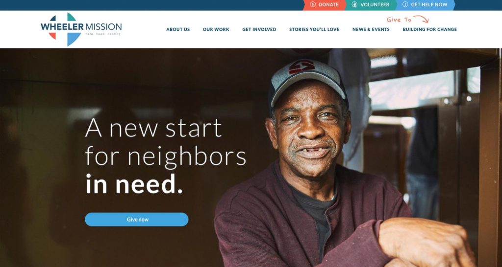
USES VISUAL STORYTELLING
Design the homepage – and your overall site – to tell the story of your organization visually, not just in words. Include:
- Compelling photos of those you serve
- Story-focused videos
- Graphics that illustrate your programs and services
In short, use visuals that, when combined, quickly and effectively tell the story of who you are, what you do, whom you serve and how someone can get involved. Weave those key storytelling visuals throughout your entire site.

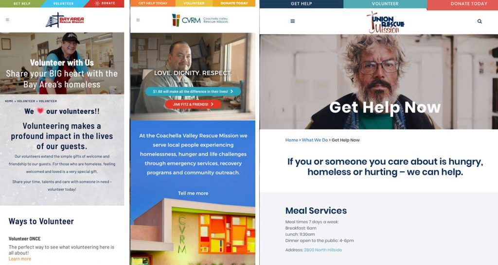
DESIGNED FOR MULTIPLE PLATFORMS
Build your website to look/function the same across multiple platforms:
- Desktop computers (Mac, Microsoft, etc.)
- Mobile devices (iPhone, Android, etc.)
- Tablets (iPhone, Surface, etc.)
A few other tips: Test your website in both horizontal and vertical views. (You’ll be surprised how differently the content displays and how you can find subtle ways to improve the user’s experience.) And test how fast your website loads – it should only take a few seconds: https://tools.pingdom.com

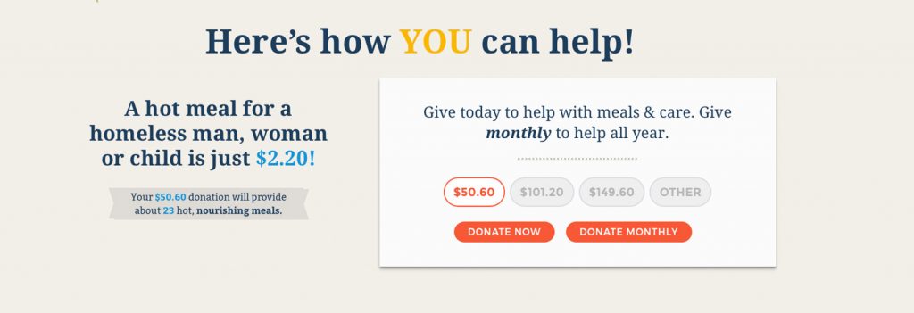
CALLS FOR ACTION
Write concise, actionable content that always circles back to this: “What do you want the user to do next?” Then add Calls to Action, or CTAs, throughout that link to actions like:
- Donate Now
- Volunteer
- Take a Tour
- Sign up for our emails
Keep it short. Keep it simple. And always tell the user what to do next!

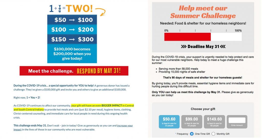
PRESENTS A VALUE PROPOSITION
Weave your organization’s value proposition throughout the messaging on your website. NextAfter does an amazing job explaining how to create and effectively use a value proposition here: https://www.nextafter.com/blog/why-should-i-give-to-you/

Yes, there are tons of choices when it comes to digital marketing – and they can be overwhelming! But by investing your time and resources in a fundraising-focused website, you’ll create a robust digital marketing program that will ultimately generate revenue for your cause.


