
Learn how to write and design your appeals to engage scanners, not just readers
From Sarah Wallin, Creative Director
Read Time: 9 minutes
As a copywriter, there’s nothing worse than absolutely laboring over every single word in a fundraising letter or email, only to hear someone later say, “I just read the headline.”
Telling a writer that you didn’t read EVERY SINGLE WORD creates a series of micro-deaths in their very soul from which they won’t soon recover.
But like it or not, there is a scientific basis for the way people read. Using eye tracking technology to create heat maps, we can see exactly how the average person engages with a letter or email. The result is called the F-pattern… and using it can optimize your nonprofit fundraising.
Digging into this data can help give great insights into how nonprofit donors may be interacting with your fundraising materials – and how to write and design your communications to maximize the way your donors will most likely interact with them.
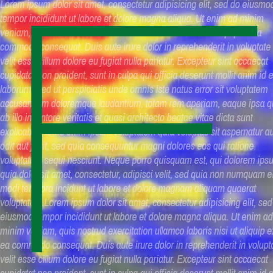
The F-Pattern of “Reading”
First, let’s talk about the F-pattern. This is the F-shaped heat pattern that you see in the images above. The F-pattern is super useful in showing us where on the page the majority of people’s eyes land… and stay the longest. Here’s a breakdown of the color coding:
RED: areas that readers looked at/read most
YELLOW: areas that readers casually looked at/read
BLUE: areas that readers spent little to no time viewing
According to the Neilsen Norman Group – the definitive researchers on the subject – readers engage with a communication in the following order:
- Users first read in a horizontal movement, usually across the upper part of the content area. This initial element forms the F’s top bar.
- Next, users move down the page a bit and then read across in a second horizontal movement that typically covers a shorter area than the previous movement. This additional element forms the F’s lower bar.
- Finally, users scan the content’s left side in a vertical movement. Sometimes this is a slow and systematic scan that appears as a solid stripe on an eye tracking heatmap. Other times users move faster, creating a spottier heatmap. This last element forms the F’s stem.
Bottom line, readers give the top of your letter the most attention, followed by the first couple of words along the left side. And that’s usually it. Depressing? Yes. Important? Also yes. It shows us the gap between all the content on a given page and what content is actually being read. As G.I. Joe famously said, “Now you know. And knowing is half the battle.”
So how might this F-shaped heat map inform how we write and design direct mail, marketing emails and nonprofit websites? In other words, how can we use this data to optimize your fundraising?
F is for Make It Fast
“I would have written a shorter letter, but I did not have the time.” – Blaise Pascal, a French philosopher and mathematician
While many of us aspire to be long-form readers, in reality, we’re a culture of scanners. Especially online… data shows that only 16% of people read word by word. So it’s critical that we write and design our fundraising and marketing communications specifically for the way people actually read.
To that end, here are 3 ways you can use the F-pattern to your advantage:
- Prioritize your content to align with the scanning “hot spots.”
This means headlines matter more than ever. Your headlines should ideally be a 5-10 word summary of your offer. These days, they have to say it all for the 80% of people not reading the rest of the letter!
Photos at the top also become a critical component – if you’re attempting to show the need, that imagery needs to be front, top and ideally, center so that your scanners encounter it immediately. Using captions may also be a big help in reinforcing your offer.
And let’s not ignore that left-hand vertical bar. Start paragraphs with important, information-rich words that will matter to your donors. Just imagine how powerful it would be for your donors to scan a letter where the majority of paragraphs started with the word “You.” We all recognize the awesome power of the word “you” in fundraising – but nonprofit fundraiser Jeff Brooks puts an even finer point on it:
“A few years ago, I was asked to create a fundraising letter template to help novice writers write decent letters. I worked for days to come up with a universal and useful outline of fundraising requirements. Then the solution dawned on me. It looks like this:
Dear [name]:
You. You. You. You. You. You. You. You. You. You. You. You. You. You. You. You. You. You. You. You. You. You. You. You. Yes, you. You. You. You. You. You. You. You. You. You. You. You. You. You. You. You. You. You. You. You.
Sincerely,
[Signature]
P.S. You. You. You. You. You. You. You. You. You. You. You. You.”
In summary, create content with your scanners in mind – recognizing their patterns and organizing content in a way that will still clearly communicate your offer.
- Break up text by adding stylistic elements, subheads and white space.
Bold. Italic. Hyperlinks and underlining. Yellow highlights. There are a variety of ways that you can create more places for your scanner’s eyes to land with strategic stylistic choices for words, phrases and sentences within a paragraph of text.
- Another effective stylistic choice: use a bulleted or numbered list.
- Scanners’ eyes are naturally drawn to a bulleted or numbered list.
- And it’s perfect for taking what would’ve been a 3-sentence paragraph and breaking it into 3 bullet points.
White space is maybe the greatest secret weapon in creating communications that engage readers… simply by creating space around photos or text. See how easy this is to read? Effectively deploying white space in your fundraising not only makes individual words easier to scan, but makes it look like FEWER words so that your scanner is more likely to engage with far more of the actual words. Plus, it’s just good design!
- Keep it concise.
I’ll make this brief: The F-pattern proves that the more text there is, the more it’ll be scanned instead of read. If you must have a large amount of text on the page, break it up with headings, stylistic elements and white space to keep readers engaged.
Recognizing the F-Pattern and the way that the majority of donors engage with your fundraising and marketing communications will help you optimize your writing and design to better engage them. Keep in mind the 3 tips above to maximize the impact of your letters, so you can sit back and smile when you hear someone say, “I just read the headline.”
Trending now! Click here to read more “Creativity & Marketing” on our website.