From the BDI Design Team
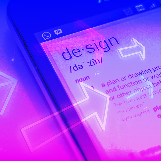
From direct mail letters to digital marketing emails to website layout, the importance of design in nonprofit fundraising cannot be overstated. You’re communicating a message – and that message needs to be clear, bold, readable and compelling. So it’s no surprise that the top nonprofit design trends in 2022 focus on making your fundraising calls to action even stronger.
A strong design can make a message jump off the page, or screen. At BDI, we turn to our experienced design team to add in the special sauce – the color, texture, style, photos – that grabs attention and connects donors’ hearts to our clients’ causes.
With their fingers on the pulse of design’s cutting-edge technologies, news and changes, our BDI designers identified some top nonprofit design trends in 2022. Keep reading to discover helpful action items you should check off to make your nonprofit communications in 2022 even more effective.
Nonprofit Design Trend #1: Eye-catching display ads get more clicks.

“Display Ads are like the highway billboard ads of the internet. Viewers are scrolling past them a million miles a minute, so an eye-catching design and an easy-to-digest message is key to grab their attention.
Here are a few design tips to get more clicks:
- Make sure your ads are simple visually and content-wise so viewers remember the core message. Text should be instantly readable, so hard-to-read fonts and wordy messages should be avoided.
- Viewers aren’t going to bookmark your ad to come back to later, so a sense of urgency to TAKE ACTION NOW needs to be created. Through design, this can be achieved by using bold or contrasting colors that stand out on the web page as well as an enticing call-to-action button.
- Animated display ads usually perform better than static ads, but the animations shouldn’t distract from the message. Simple animations work great to grab the viewer’s attention, but the call to action should be clear and the main focus.”
– Mindy Bortz, Senior Designer/Studio Manager
Action items
- Review the text on your display ads. Can you easily read it? If not, consider editing to simplify your messaging.
- Identify the call to action on your ads and whether the sense of urgency compels a viewer to act immediately.
- Incorporate simple animation that amplifies your messaging in the ad.
Nonprofit Design Trend #2: Direct mail is not dead.

“Business reply mail is changing. Although it’s still an effective response device, there has been a decline in Business Reply Mail as the standard response option in direct mail marketing. Whether due to the increased paper and postage costs, postal delivery delays, supply chain disruptions or a larger audience in the digital space, there has been a steady rise in digital response channels over the past 20 years. But, print is not dead and direct mail works; however, both have to be leveraged to meet these challenges.
Trends to look for: large postcard/billboard mail; more concise copy (shorter sentences, smaller paragraphs, bullet points) to fit the smaller mail formats; airy layouts with dynamic, high impact colors and photos, and strong calls to action; direct mailings that coordinate with digital marketing; more online terminology (‘follow us,’ ‘visit our website,’ ‘scan the QR code’) and digital response options (QR codes, websites, ‘PURLs’ or personalized URLs, social media).”
– Lena Salazar, Senior Production Artist
Action items
- Edit down your copy to fit smaller mail formats and leave room for white space, which will make your message and calls to action stand out.
- Integrate your print communications with digital calls to action and response options (“follow us,” “visit our website,” QR codes).
Nonprofit Design Trend #3: Visual consistency makes emails pop!

“Having a consistent visual ‘look’ among the graphics and illustrations in your campaign is important. This ensures that each campaign email shares a single voice that readers and potential donors can easily recognize. That consistency can make a big difference in the overwhelming inboxes most people contend with. Also, it’s nice to see a vivid color palette in email design! Another eye-catching tactic to remember.”
– Chelsea Campbell, Production Artist
Action items
- Thoughtfully choose your campaign color palette and visual “look” and make sure everything is consistent.
- Be bold with a vivid color palette to stand out in your donors’ and potential donors’ inboxes.
Nonprofit Design Trend #4: Branded social media is critical.

“A strong social media campaign is an essential tool for nonprofits to gain more of an online presence. Having a clear and consistent brand through various social media channels is a must. Text-free avatars (profile picture) is the first and easiest way to do this. People will see the image and visually and mentally associate the avatar with the Mission brand.
A verified account with a clear and succinct bio describing the Mission’s cause are additional things which will help too. This establishes credibility with the brand and will likely improve search results organically.
Lastly, posting often (3-5 times a week) using the 80/20 rule with ‘link in bio’ will help increase exposure and online presence. The 80/20 rule is as follows: 80% content serving Mission and programs (inspirational quotes, photos in real time showing Mission life) and 20% direct action posts (asking to give, volunteer, repost, etc). Using “link in bio” in these posts is a good way to drive traffic to the Mission website.”
– Nik Ahlstam, Digital Production Designer
Action items
- Use the same consistent and clear profile image to represent your organization across all of your social media channels.
- Follow the 80/20 rule of posting: 80% content shared is purely for engagement purposes, building your identity and relationship with your followers. 20% of posts are direct calls to action.
Nonprofit Design Trend #5: For newsletters, less is more.

“Newsletters are one of the most powerful ways to build lasting relationships with donors. Here are some of BDI’s best practices we can continue on to 2022:
First, to get readers to open your newsletter, the envelope should stand out from their mounds of mail with colorful graphics or imagery.
To make the most of the readers’ or donors’ time, apply the old cliché, “less is more”: Make articles short but concise and appeal to their emotion; use large, bold and/or attractive fonts for headlines to catch their attention; use subheads, pull quotes, and highlighted text, bolded or underlined, that would interest the readers to read more or, if they don’t have enough time to read the entirety, to get the gist of the story; whenever possible, use more compelling illustrations and photographs to tell the story than lengthy texts; and make sure the call to action is clearly communicated.”
– Erika Castro, Production Artist
Action items
- Use a bold, eye-catching envelope to get readers to open your newsletter.
- Make your newsletter easy and engaging to read by using bold fonts, underlines, call-outs and compelling photos.
At BDI, our designers are hard at work implementing these top nonprofit design trends into our clients’ 2022 print and digital communications. And while trends may come and go, remember this: Without design, words are just… words. An effective fundraising campaign leverages strong design elements and strategy to release generosity from donors’ hearts.
Email BDI’s Design Team now >>
Trending now! Click here to read more “Creativity & Marketing” on our website.