

The last time you heard from me, I spent some time on some key strategies to help you create a fundraising-focused website. Today, I want to focus on an aspect of your website that’s key to maximizing your fundraising success: your donation page.
That’s because one of the primary goals of your visually interesting, storytelling-focused website is to motivate any visitor to click through to your donation page and ultimately, make a donation.
Your donation page is your best opportunity to share your value proposition – in other words, why someone should give to your cause. But that value proposition isn’t worth much if your donation page isn’t donor optimized.
What is a donor-optimized donation page?
A DONOR-OPTIMIZED DONATION PAGE:
- Easy to use on both desktop and mobile platforms
- User experience free of any friction during the giving process
- Shares your value proposition clearly and compellingly
So the obvious question: How do you know if your donation page is optimized in the ways listed above?
Here are 4 key tips to assess your nonprofit’s donation page:
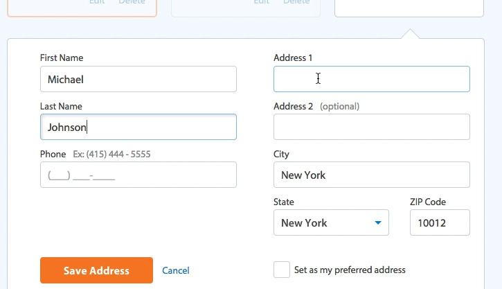
1. Is your donation form easy to complete on both desktop and mobile?
Try to keep the form as short as possible. After all, the longer the form, the more time a potential donor has to change their mind! One way to shorten up the length on desktop is using a 2-column grid instead of a 1-column grid to reduce the scroll-down effect of a single column.
You want a form that’s easy, clear, secure and doesn’t present too many other choices beyond the choice to give. For example, having several checkboxes so that donors can designate their gift can be overwhelming, especially for new donors – and it often results in people abandoning their donation completely.
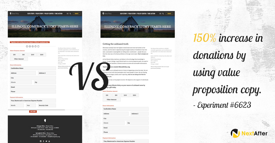
2. Does it include an image and supporting “Value Proposition” copy?
Remember that your value proposition answers this question for a potential donor: “Why should I give to you instead of someone else or not at all?”
Never assume that just because someone visits your donation page that they’re 100% committed to making a donation – they often need further confirmation that their gift is needed and that it’s the right decision to give to your organization. To show and not just tell them that their gift is needed, use an image that clearly reflects the need(s) that your nonprofit is meeting.
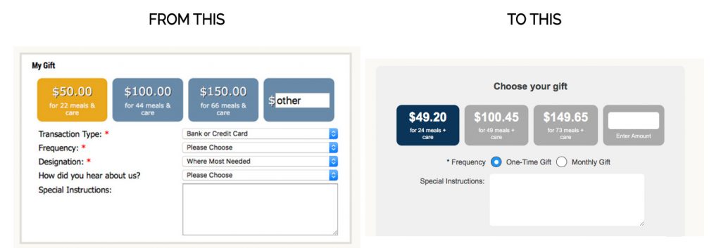
3. Are there any possible friction points to completing a donation?
Take the time to try out your own donation page by making a donation and assess each step. Look at the information required on the form: Is it needed for the transaction? Is it used by your organization? If not, consider removing it to reduce friction.
For example, on many donation pages today, I still see this question: “How did you hear about us?” If that information isn’t used to improve your marketing, I’d advise removing that question, as it has the potential to be a point of friction to the donation. (With good tracking, you should already know the answer to that question anyway!)
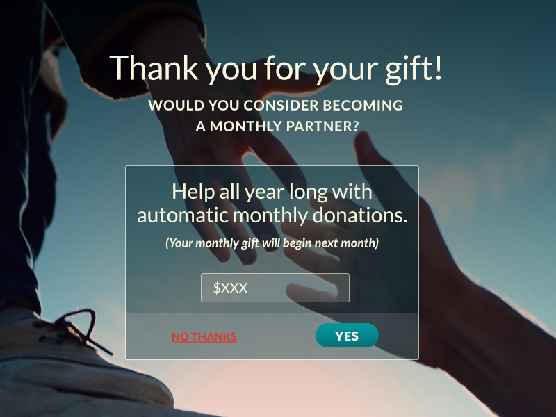
4. Are you heavily promoting your Monthly Giving program?
On many donation pages, monthly giving is an afterthought or option. Don’t hide it – shout it out!
First, make sure the monthly giving option is prioritized and clear visually. The option should leap out at a potential donor. Second, if your donation platform offers it, add a pop-up lightbox that appears AFTER the donor has made their one-time gift. In the lightbox, ask the donor to make their gift monthly.
In our experience, a lightbox with this monthly giving ask has a conversion rate of 1.4% which provided a client with a 33% increase in new recurring donors. What an easy way to build your monthly donors!
A donor-optimized donation page is vital to your fundraising success – so go ahead and invest some time and resources into making it the best it can be for your donors. By improving your donation page, you’ll create a robust digital marketing program that will serve your ultimate goal: more donations that help more people in your community.
Check out last week’s Quick Shot: “Meeting Your Donors in the Midst of Their Crisis” >>


